This week has been a bit of a bummer for gay rights, so I wanted to look at some encouraging news for LGBT people. Earlier this year the Census released its demographic profile, which contains for the first time Census Tract-level data on same sex couple households. While same-sex married & unmarried partner households have been counted by the Census for a while now, this is the first time the Census has published detailed spatial data on where gay and lesbian couples live.

Kansas City’s Gayborhood?
This enables so much interesting analysis. I have been curious about the concentration of same sex partner households in the Kansas City metro. Below you can see where same-sex couples are concentrated (density of same-sex coupled people per square mile), the share of gay couples (as a share of all coupled people, not total population), and the total number of same-sex couples. Throughout this post, I use “gay” to refer to all same-sex couples. I would use the word “queer”, but that implies this metric is more inclusive than it actually is. It’s also worth noting that the unit being measured is the people same-sex relationships, not the number of couples (“same-sex coupled people” is a bit of a mouthful, but it is what I mean if you see “same sex couples” in this post).
Data from these visualizations came from the Census’s 2020 Decennial Census Demographic Profile. I have combined married (variable DP1_0116C) and unmarried partner (variable DP1_0118C) people in same-sex relationships.
I prefer the density of gay couples per square mile or the share of gay couples over the total number of gay couples, and if you page through the maps you can see why. While tracts generally have a roughly equal population, there is enough variation in population and size that the total alone can be a bit misleading. When looking at the absolute totals, neighborhoods in Brookside and Waldo, Northeast Johnson County, and Briarcliff stand out. If it were a single census tract, the downtown loop would be about as large as other tracts in Midtown, Briarcliff, Brookside, or Waldo, but it would have the highest overall number, with 104 same-sex coupled people. The map of same-sex couple density does a better job telling that story.
Gay Couples per Square Mile in the Kansas City Metro, 2020
Percentage of Gay Couples in the Kansas City Metro, 2020
Total Gay Couples in the Kansas City Metro, 2020
Jackson County Census Tract 178 in Midtown (from 31st to 36th Street and Main to Troost) arguably has the highest share of same-sex couple households. It also has a high percentage of gay couples (14% of couples, where the metro average is just 1.6%) and is relatively dense. Here are the top 10 census tracts, based on the average percentile rank of all three measures:
Top 10 Tracts for Same-Sex Couples
National Summary Statistics
The below tables show the rankings of metropolitan areas and counties by the total number of same sex couples. While the ranking is about what you’d expect, sorting by the share of same sex couples might surprise you. The Santa Fe, New Mexico Metro, it turns out, has the highest share of same-sex couples. Who knew? (Probably same sex couples from New Mexico).
Applying Measures of Residential Segregation
Since we’ve never had more detailed spatial data on same-sex couple residential location, we haven’t been able to do things like measure residential segregation or concentration for same-sex couples until now. For this exercise I’m using the dissimilarity index, which helps to describe how evenly distributed two groups are. If 1.6% of Kansas City couples are same-sex couples, in a metro with zero gay/straight segregation, you would expect each tract to be about 1.6% gay. That’s clearly not the case, since we know from looking at Kansas City that the share of same-sex couples ranges from 0 to 33%. If the gay population were evenly distributed across all census tracts in Kansas City, the dissimilarity index would be 0. The dissimilarity index also represents the percentage of a group’s population that would have to move in order to have an even distribution throughout the metro area.
Douglas Massey and Nancy Denton, two legendary sociologists, reviewed a variety of other measures of residential segregation. I haven’t done it here, but it would be worth looking at other measures of exposure, concentration, centralization, and clustering – all of which can be calculated with newly-released census data.
Large Metro (1M+ population) Dissimilairty Indices
Micropolitan (>50k population) Dissimilairty Indices
I don’t really know what to make of a gay-straight dissimilarity index. On one hand, increasing societal tolerance and equality before the law means that gay people ideally face less discrimination in society and in housing markets. A more generally tolerant society means we don’t have to flee to regions and neighborhoods where we feel safe. On the other hand, queer spaces and culture are so special, and I wouldn’t want a future without them (especially since – writing this from Missouri – progress towards acceptance and equal rights isn’t linear).
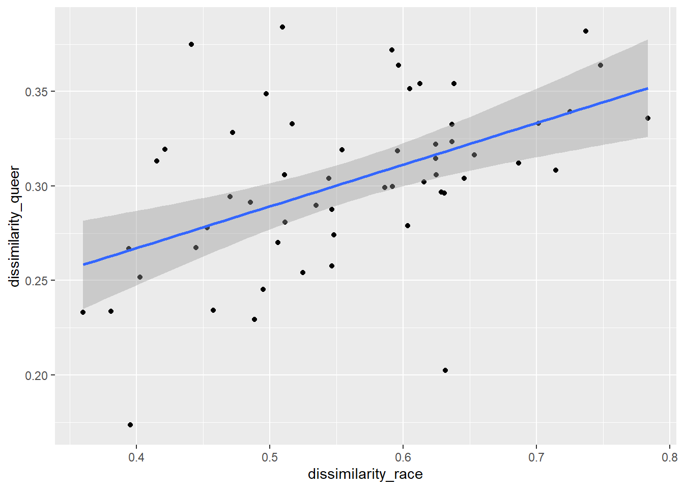
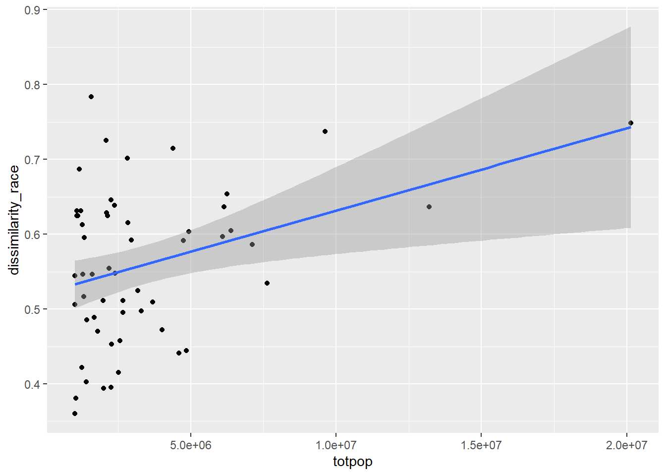
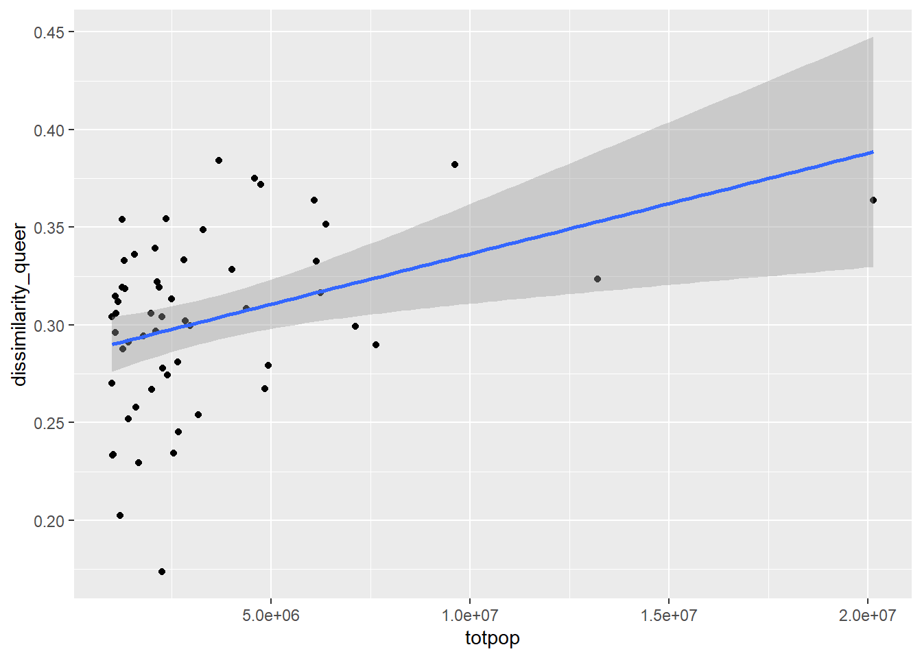
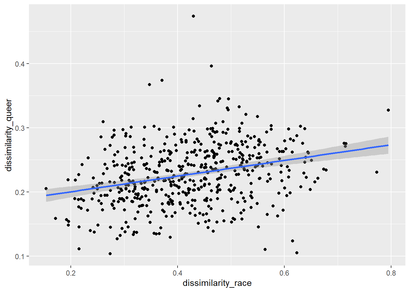
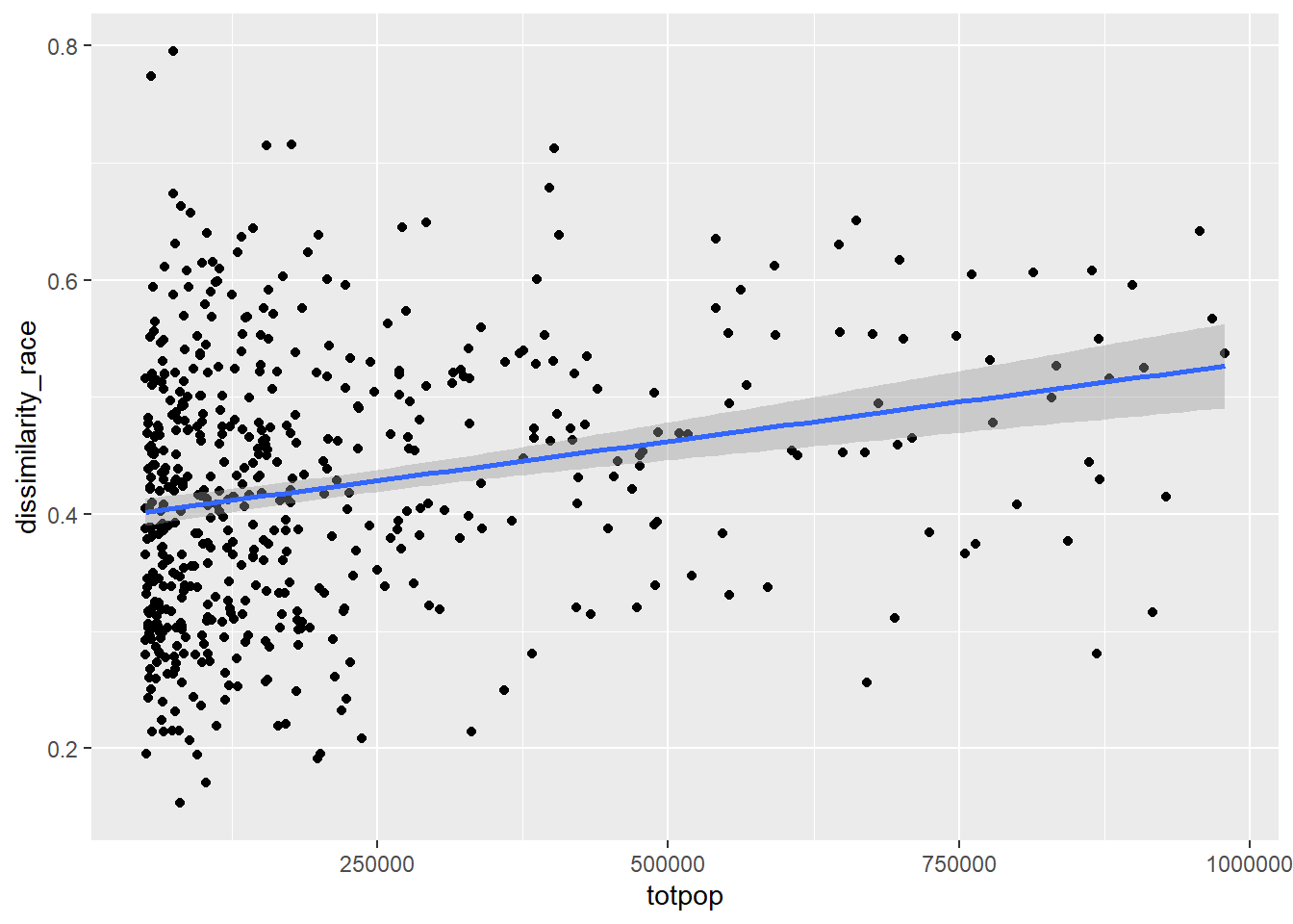
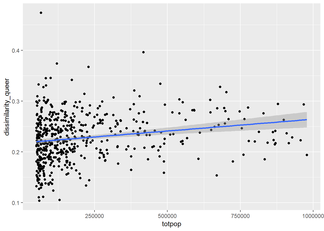
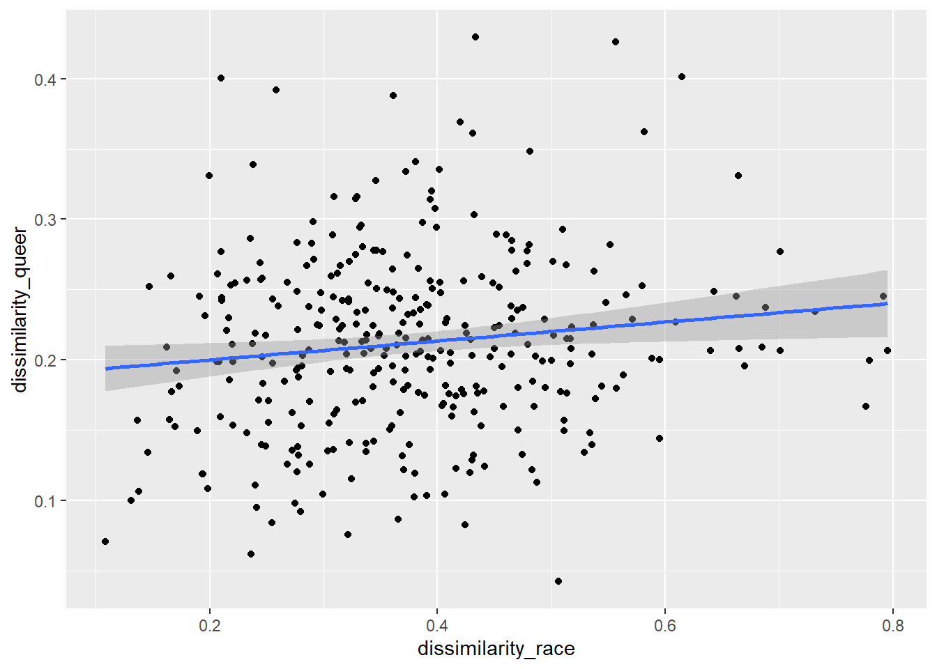
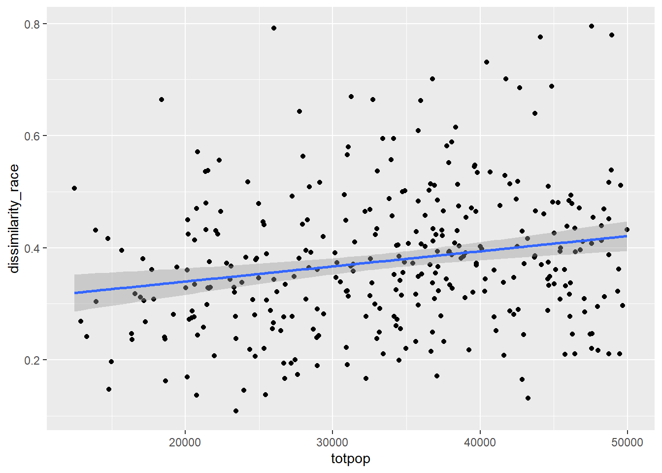
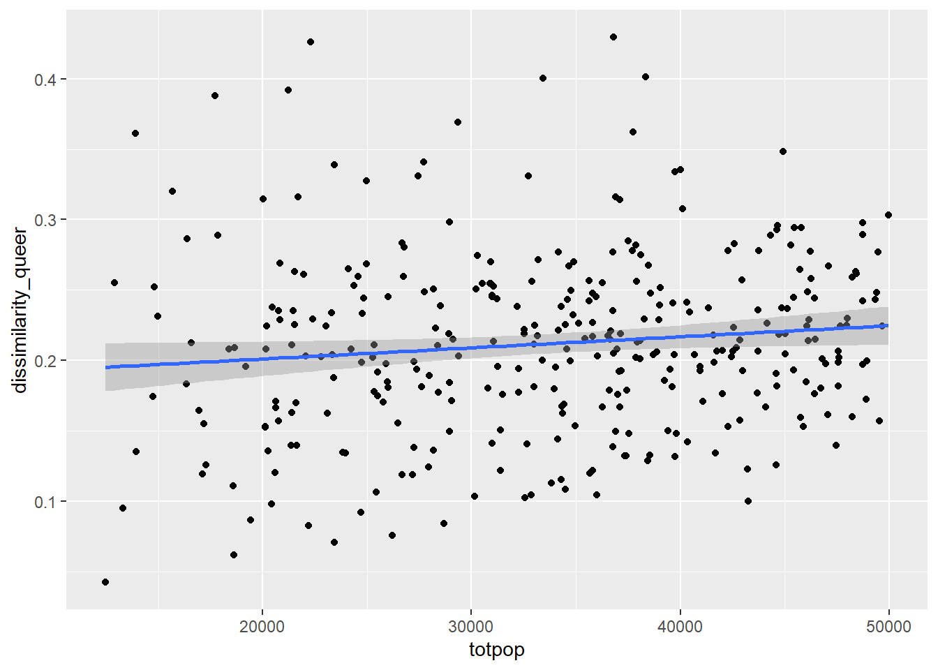
I’m also curious about the things that correlate with a gay-straight dissimilarity index. For large metro areas (1M+ population), it generally seems like a higher population is associated with both higher Gay-Straight couple and Black-White dissimilarity indices, and there’s also a correlation between the Black-White and Gay-Straight couple dissimilarity index. Maybe other demographic indices would be useful in understanding this trend.
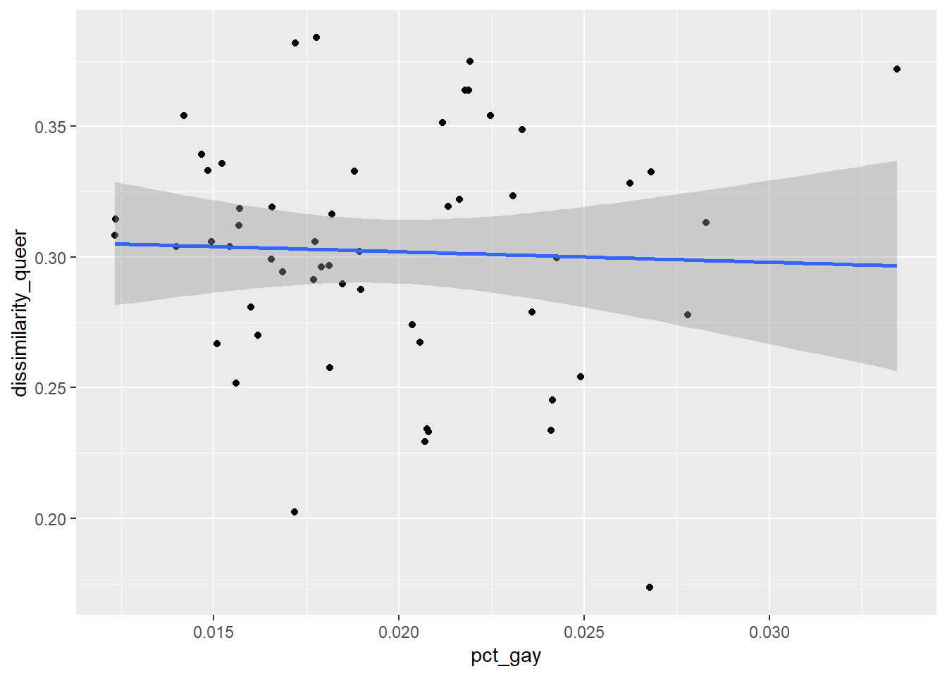
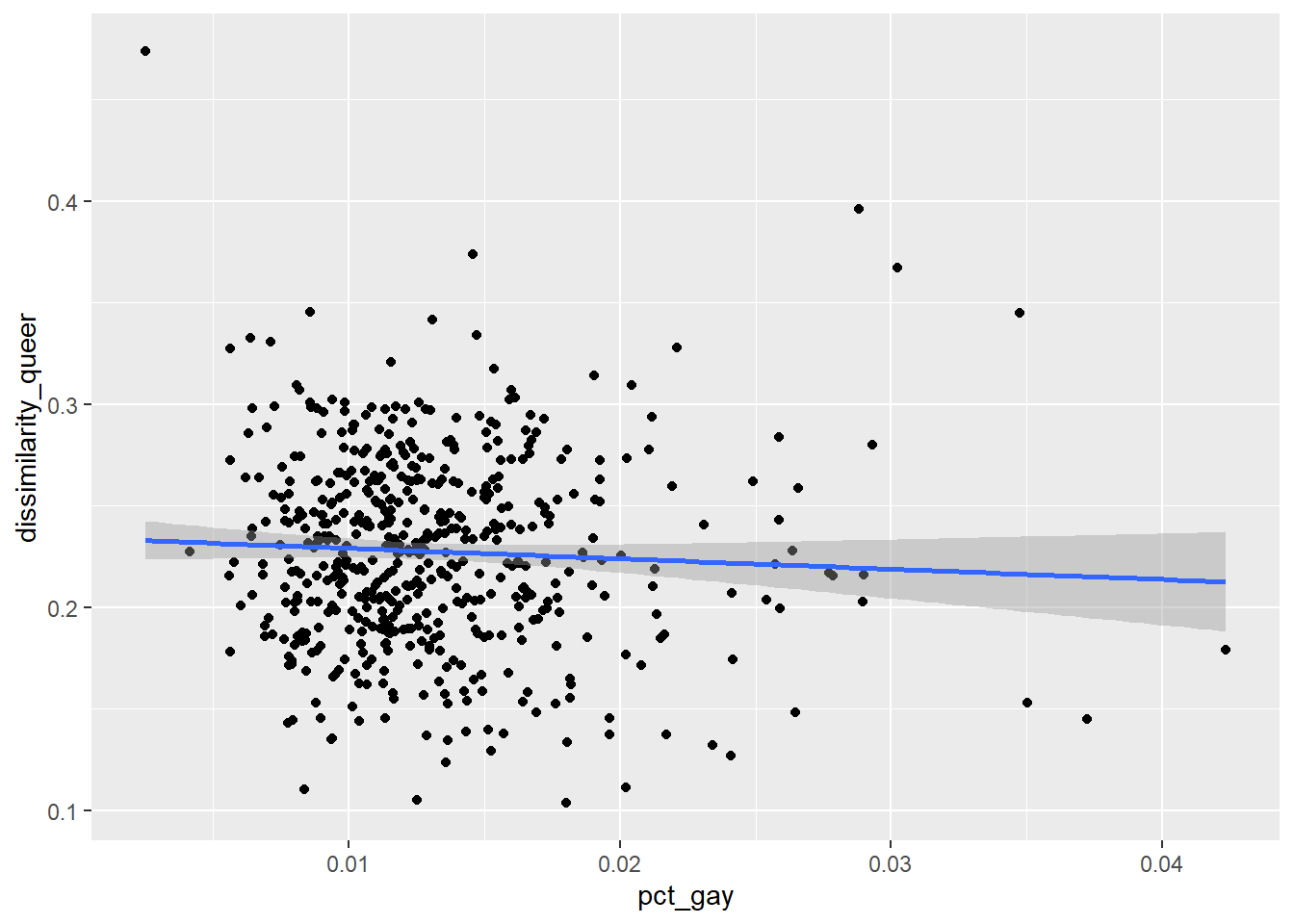
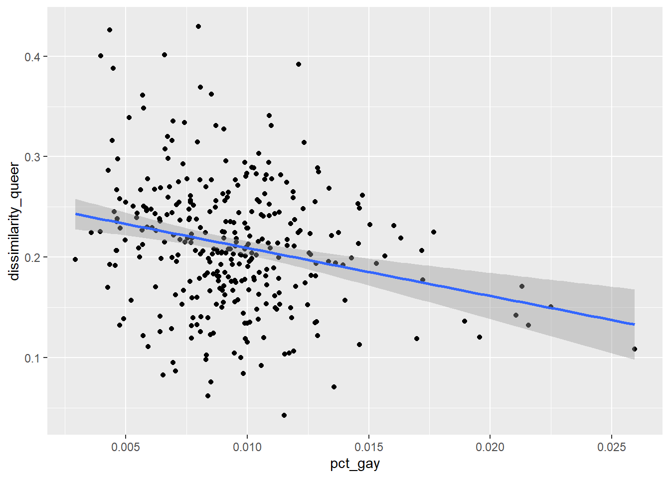
I expected to see decreasing levels of dissimilarity as the relative gay population increases. There wasn’t much of a trend for large or even small metros. However, for Micropolitan areas (areas with a population of less than 50,000), it looks like the dissimilarity index decreases as the proportion of gay couples increases, as shown in Figure 3 (c). Does that mean for small communities, tolerance increases with the gay population? If you’re reading this and have some ideas or have seen some research on any of this, please share it with me at hello@joshboehm.xyz.
Caveats, Conclusions, and Further Reading
I hinted at this earlier in the post, but there is a major limitation in understanding queer people just through the lens of same sex relationships. This metric excludes anyone not in a cohabitating relationship, bisexual men or women in an opposite-sex relationship, trans people, and other queer people. A revised question or series in the American Community Survey asking about sexual orientation and gender identity would provide researchers and policymakers with better visibility into the lives of queer people. This data could be cross-tabbed with other questions on race/ethnicity, income, and ability to provide a more intersectional and complete view of the LGBTQ+ community. It could also provide better time-series data and make for interesting researching using census microdata.
One other caveat that to keep in mind is the Census’ approach to differential privacy, which intentionally alters data to avoid disclosing personal information that could be used to identify a person. While I think this is less likely to be a problem at a geography like a Census Tract, I haven’t looked into the issue much.
I know there’s a lot of awful discouraging news lately, but hopefully these census figures, while still not representative of the full picture, show that our community is surviving and thriving. Happy pride! 🌈
Further Reading / Links
- NPR: What the 2020 census can – and can’t – tell us about LGBTQ+ people
- American Planning Association: Why We Need Queer Urbanism
- Michael Frisch: Planning as a Heterosexist Project
- Douglas Massey & Nancy Denton: The Dimensions of Residential Segregation
- U.S. Census: Measures of Residential Segregation
- Kyle Walker: Analyzing US Census Data
Some ideas for future amateur research in this topic:
- Residential locations of gay people in top 10 counties or metros
- Calculate measures for exposure, concentration, centralization, and clustering
- Correlates of same-sex couple tracts and housing types/tenure/ownership, income, race/ethnicity, age, etc
- Spatial relationship between gay establishments (bars) and same-sex couple households